
Google UX Design Certificate Project 2
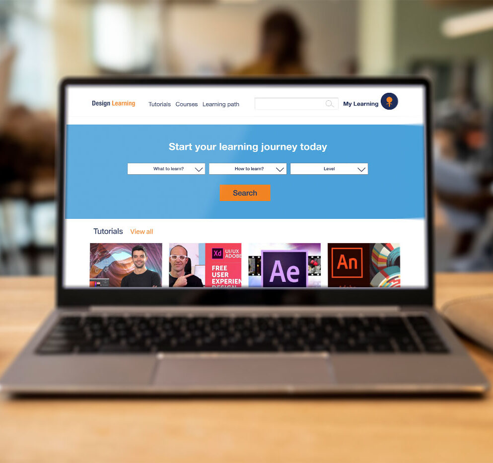
Explore design tutorials with Design Learning website
Designing a dedicated website for specialized design courses and tutorials.
Empathize
Define
Ideate
Prototype
Test
Overview
The problem
There are a lot of problems with expensive formal education for designers. The time commitment and limited time for learning can be a challenge for some people. Some people also face the challenge of having a busy schedule and lack of quality learning materials. There are also few places where you can get training in a specific design fields for a reasonable cost. Also, the variety of learning resources and professional support available is limited.
Project goal
The goal of this project is to design a prototype of the educational website that allow designers or even people who just starting to learn design to access quality learning video tutorials that will help them advance their professional skills or learn design fundamentals on their own schedule and time commitment.
Role
UX/UI designer, UX researcher
Project Duration
Jan 2022- Feb 2022
Responsibilities
User research, ideating, prototyping, wire framing usability testing
Understanding the User:
- User research
- Personas
- Problem statements
- User journey maps
User research summary
The foundational research which included secondary research, competitive audit, and primary unmoderated qualitative research revealed information about the need of a dedicated design tutorials website that will take into account the most important users needs and solve existing users problems.
User Pain Points
disorganized broad tutorial’s selection
It is easy to get lost with a broad selection of tutorials that are disorganized
Lack of specific courses
It is hard to find advanced skills tutorials, and specialized courses. Most of all tutorials are general and beginner- intermediate level.
Interactivity
There is no way to ask a question or advice while watching tutorials.
Lack of structure and preview option
People struggling to find the desired course because they need to watch full long videos to understand what is covered in the tutorial. This process is very time-consuming.
Personas
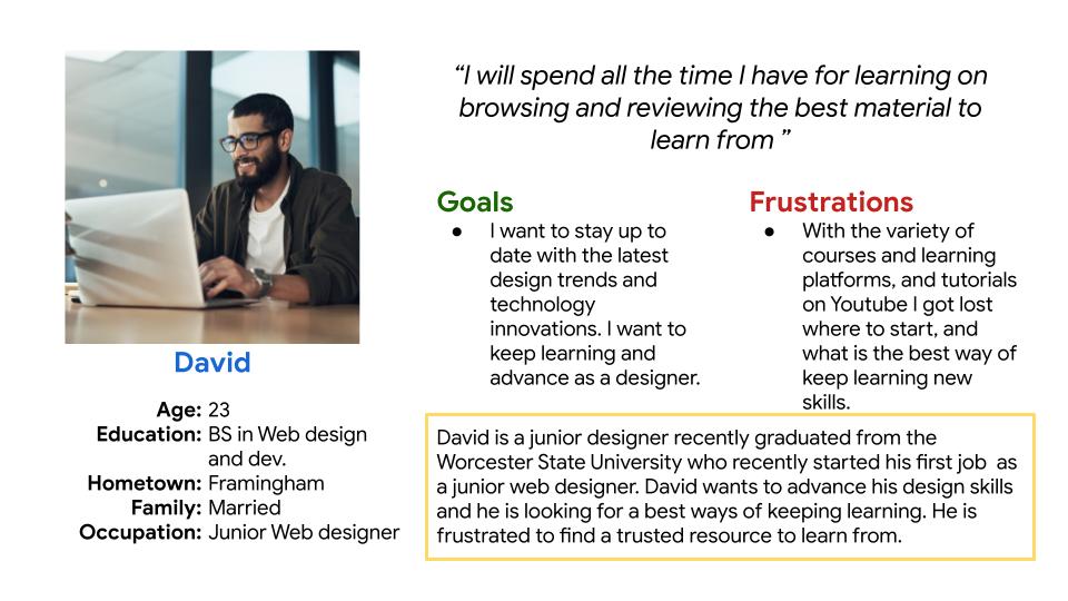
David
Problem statement
David is a junior graphic designer,
who needs to advance his skills, because he wants to quickly progress with his career and to get higher role in the company.
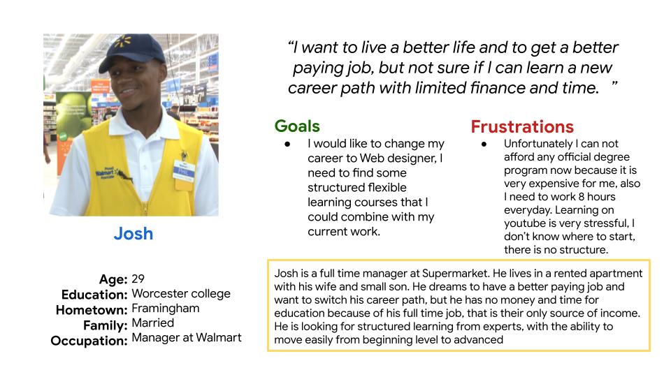
Josh
Problem statement
Josh is a supermarket manager,
who needs to change his career to a web designer
because he wants to get higher paid job and work remotely.
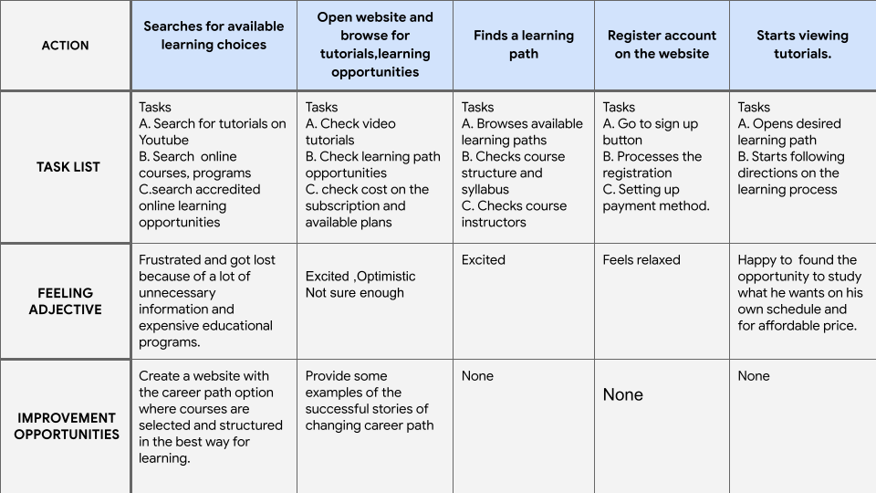
User journey map
User journey map helped to get better understanding of users needs, and how design learning website could make people’s learning experience easier.
Starting the design
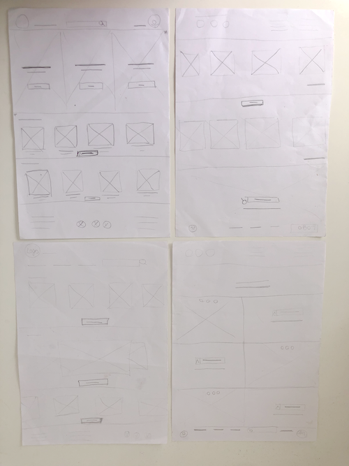
Paper wireframes
Paper wireframes was a quick way to experiment with ideas for the website pages.
The goals for the home page are:
- Simple layout
- Easy navigation
- Straightforward flow
- Logical structure
- Useful functionality
Paper wireframe screen size variations
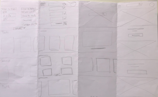
Paper wireframes helped me to experiment with different ideas, and quickly determine what I like the most. My goal for the mobile version was to create a design that will be easy to view on the smartphone.
Digital wireframes
While designing wireframes for the design learning website I kept in mind user pain points that need to be solved.
In order to create timeless and painless experience in searching proper material, I’ve organized tutorials in different groups depending on the different types of users and their needs.
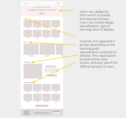
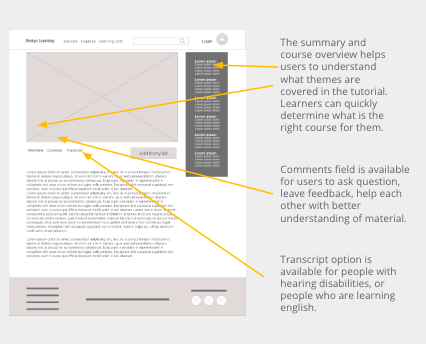
Viewing tutorials screen design was created with principles of inclusive design in mind, and was adopted for people with disabilities or temporal disabilities, and for international students to whom english is a second language.
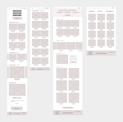
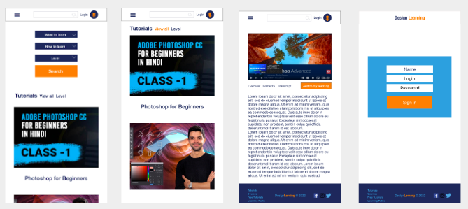
Digital wireframe screen size variations
My goal was to develop a website prototype that could be easily viewed from different devices and for diverse group of people with different abilities.
Usability study findings
Refining the design
I refined my designs based on the usability study findings: tutorials, and courses can be filtered by the level of difficulty, bigger search button recreated to maintain proportions and hierarchy.
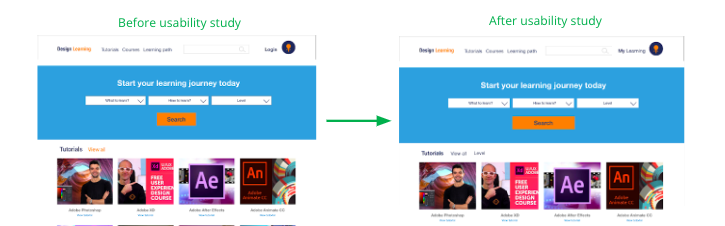
Based on the usability testing findings mobile version of the website was refined to make a website easier to view and use for older people.
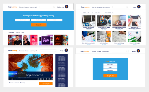
Mockups: Screen size variations
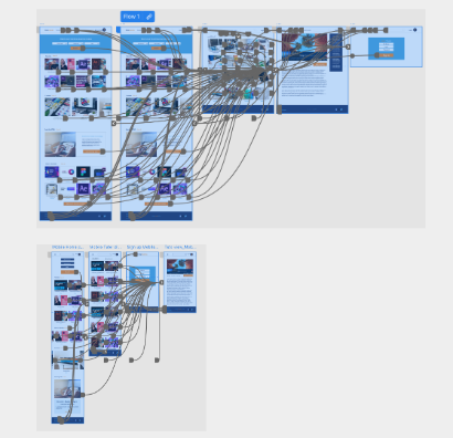
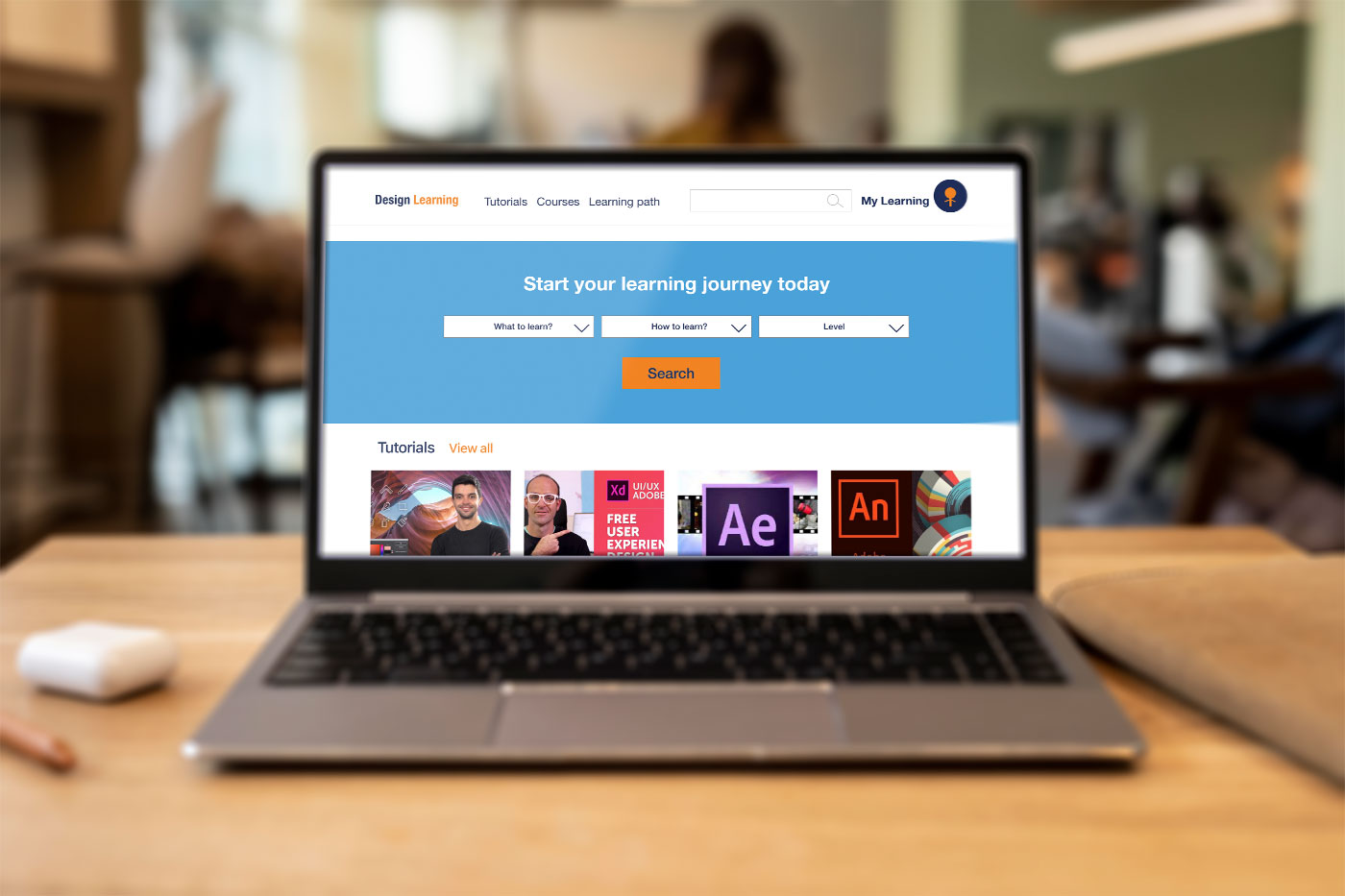
High-fidelity Prototype
Prototype can be viewed at different screen sizes
My takeaways
After completing this project I understood that for creating a successful website is extremely important to know your audience and to do user testing with a diverse groups of people, as all people have different levels of abilities, and a website needs to be suitable for users we are designing for.