Food delivery app
Google UX design certificate project 1
Project Overview
Challenge
During my certificate program at Google I was tasked to design a food delivery app for a local restaurant.
As a family-owned business serving the suburb area of Shrewsbury town, UX Locale has built a reputation for offering high-quality, fresh, and flavorful food made with seasonal, local ingredients at reasonable prices. However, the restaurant’s existing ordering process, which relies on customers placing orders through phone calls, has proven to be inefficient and cumbersome, leading to potential lost sales and customer dissatisfaction.
In today’s fast-paced, digital-driven world, customers expect a seamless and convenient experience when ordering food for delivery. The lack of a dedicated food delivery app for UX Locale restaurant has created a gap in meeting these expectations, resulting in missed opportunities to attract new customers and retain existing ones.
Project goals
Develop a user-friendly food delivery app that will save customer’s time on the meal planning and ordering, and helps UX Locale restaurant enhance its overall customer experience, drive increased orders, and strengthen its position in the competitive food delivery market.
Project scope
Develop Food delivery App
Role
UX/UI designer, UX researcher
Team
Self-directed with feedback from the peers
Project duration
Sep 2021- Dec 2021
Responsibilities
User research, ideating, wireframing, prototyping, usability testing
Tools
Figma, Mirro, Adobe Illlustrator, Photoshop
Understanding the User:
- User research
- Market research
- Competitive audit
- Personas
- Problem statements
- User journey maps
User research summary
I conducted interviews and created empathy maps to understand the people I am designing for, their expectations, needs, and pain points.
A primary user group identified through research was busy working families with children, who want to feed their kids healthy food but have no time for cooking or visiting restaurants. This user group confirmed initial assumptions about the UX Local customers.
I also conducted a market research to get a better understanding of the available food delivery apps, their key features, and customers’ satisfaction with the product. Research also revealed that time was not the only factor limiting users from cooking at home or visiting restaurants. Other problems customers faced while planning their meal included obligations, interests, challenges with ordering from the website, difficulties with shopping for groceries to cook meals, COVID restrictions, and limited abilities.
User Pain Points
Time
Working adults desire to maintain a healthy diet, but do not have time for cooking, visiting restaurants, or time consuming ordering process
IA
Text- heavy menus are difficult to read and hard to understand what the meal is look like.
Security
Customers feel unsecure and inconvenient when ordering over the phone and providing their credit card details
Long menus
Customers instead of reading long menus prefer pre-defined dinner options.
Personas
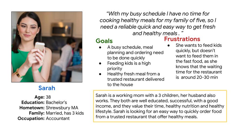
Sarah
Problem statement
Sara is a busy working mom with three children, who needs an easy and fast way to order and deliver healthy and fresh meals from the trusted restaurant, because she have no time to cook meals or to go to the restaurant
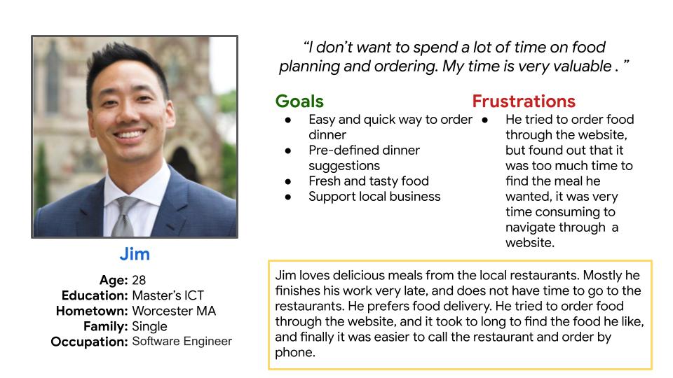
Jim
Problem statement
Jim is a working adult who works late hours, and looking for a fast way to get fresh meals to his table, because he have no time to browse menus on the website, or to go to the restaurant.
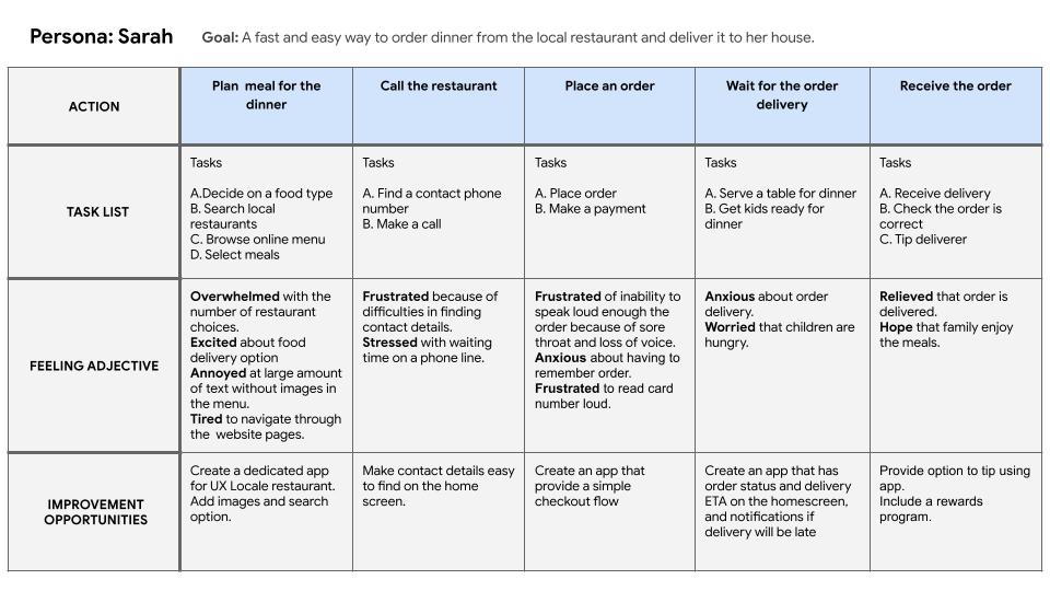
User journey map
Mapping user journey for Sarah revealed how helpful for the UX Local customers would be creating food delivery App.
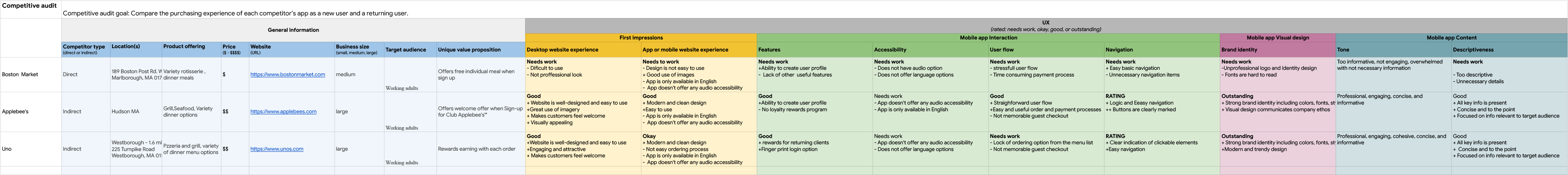
Competitive audit
Starting the design
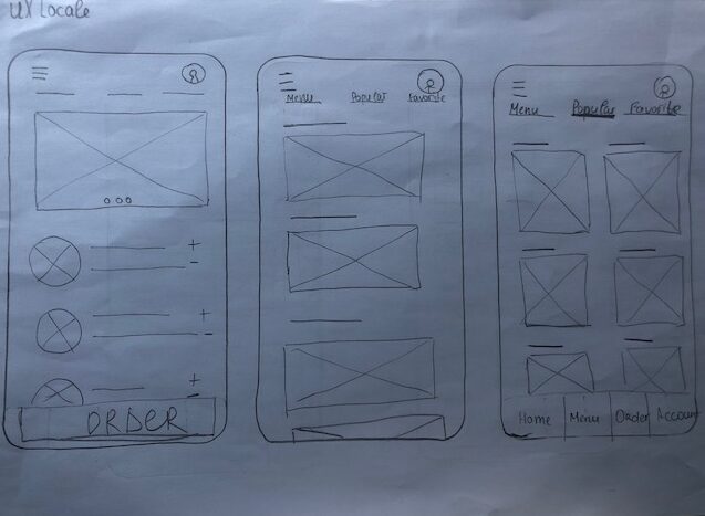
Paper wireframes
Iterating on the screens of the app helped me to choose the best elements for digital wireframes that are addressing user pain points. The main goal for the home screen was to incorporate easy and straightforward ordering process to save user’s time.
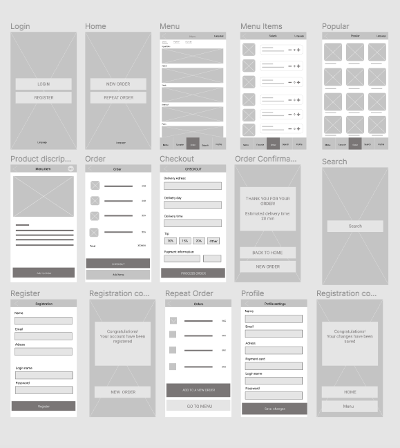
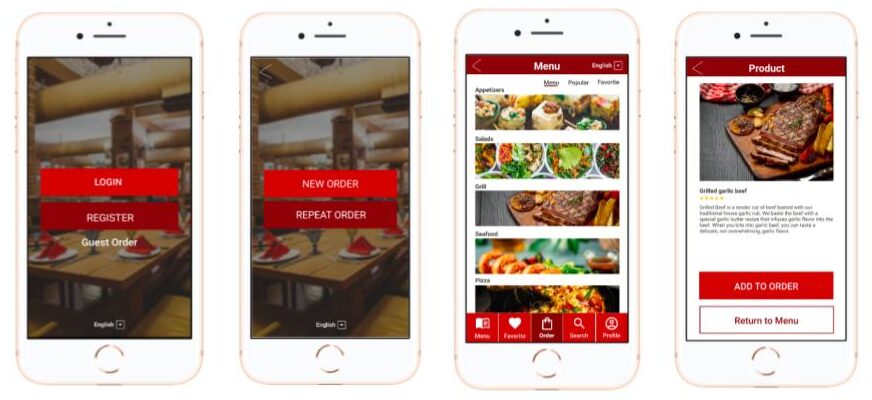
Digital wireframes
A very simple home page design focuses user’s attention on the main goal. Returning users have a great opportunity to quickly repeat their previous orders. Less choices save time on making decision.
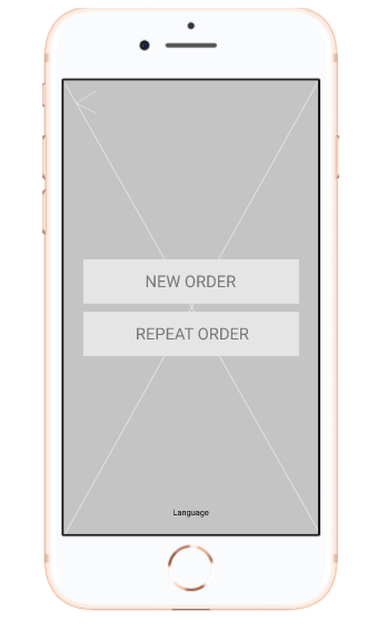
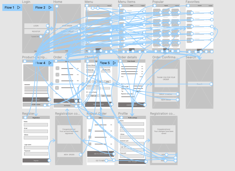
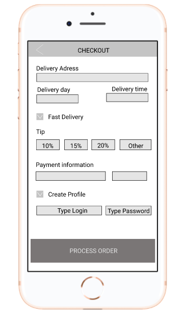
Low-Fidelity Prototype
The low-fidelity prototype connected user flows for returning customers and new customers of ordering and delivering food from the restaurant, so the prototype could be tested with users.
Usability study findings
Round 1 findings
Round 2 findings
Refining the design
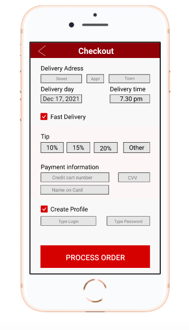
After two rounds of usability studies, in order to address user pain points, some additional pages were created, the layout of some screens and the functionality of the buttons were refined to create functional and cohesive design, that is visually appealing, easy to perceive and navigate.
The perception of the information became even easier after it was grouped and separated by the use of space and color.
Clickable checkboxes added real feel of the product.
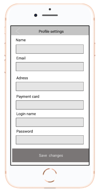
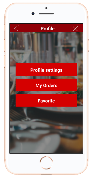
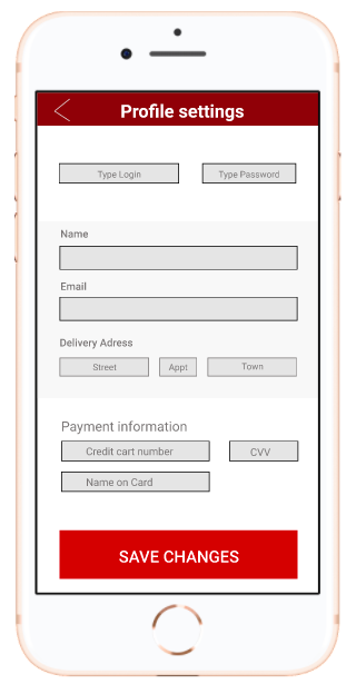
Before the usability study a Profile button navigated to the profile settings only. It was difficult for registered customers to find their previous orders, for this reason additional profile page with three options to quickly find products was created. Also, text fields of the setting’s screen where grouped and separated using space and color to make the layout easy to perceive.
High-fidelity Prototype
Impact
Building a personal finance management app and website will have a positive impact on the financial health and well-being of young people and society as a whole.
By providing accessible and easy-to-understand information, young people can learn how to budget, save, and invest their money wisely. This can help them avoid common financial pitfalls, such as overspending and debt, and set them on a path towards financial stability and success.
What I learned
Designing the UX locale restaurant app has been a challenging and, at the same time, rewarding journey. This project helped me realize how important the research, feedback and usability studies phases are in the product development cycle.
While creating products it is extremely important to understand who will use your product, what they value, what problems they want to solve, what their expectations and needs are.
If we want to develop successful product, first we need to focus on creating useful product that solves users problems, in which case only users can tell us where our product should go and what should be improved.