
Personal Finance Management
Google UX design certificate project 2
Project Overview
Challenge
Managing personal finances can be a difficult task for many people. In today’s economy, there is a lot of pressure to make ends meet and keep up with the rising costs of living.
There is a number of problems people face when it comes to managing their personal finances. One of the main problems is the lack of financial literacy among adults. According to a study by the National Financial Educators Council, only 24% of adults have basic financial knowledge, and 43% of adults report not having a budget.
The lack of knowledge about financial management and the difficulty of understanding complex financial concepts often leads to financial instability, poor financial decisions, debt, insecurity and financial stress.
Another challenge is the difficulty of changing financial habits. According to a study by the University of Scranton, only 8% of people achieve their New Year’s resolutions, and financial goals are among the most commonly failed resolutions. This suggests that simply providing information about personal finance management may not be enough to change people’s behavior.
Additionally, many people lack access to the right tools and information to help them better manage their finances. This can lead to mismanaged finances, missed payments, and an inability to achieve financial goals.
This highlights the need for motivated financial education and resources, to help adults develop good financial habits and make informed financial decisions.
Project goals
Develop a user-friendly website and app that motivates people to learn the basics of personal finance and helps them manage their finances in an engaging and accessible way.
The platform will provide clear and concise information about budgeting, saving, and managing money, and use simple language that is easy to understand for beginners.
The design will focus on engaging content, intuitive navigation, and user-friendly features that encourage and motivate users to develop healthy financial habits. This will include features such as setting goals, tracking progress, and providing rewards for good behavior.
Additionally, the website and app will provide educational resources to help users gain a better understanding of basic financial concepts.
The ultimate goal is to empower users to take control of their finances and achieve their financial goals.
Project scope
Develop app and website
Role
UX/UI designer, UX researcher
Team
Self-directed with feedback from the peers
Project duration
Sep 2021- Dec 2021
Responsibilities
User research, ideating, wireframing, prototyping, usability testing
Tools
Figma, Mirro, Adobe Illlustrator, Photoshop
Understanding the User:
- User research
- Market research
- Competitive audit
- Personas
- Problem statements
- User journey maps
Conducting research allows me to gain a comprehensive understanding of users, including their challenges, aspirations, capabilities, constraints, thought processes, and objectives. This knowledge is crucial for developing effective solutions in the later stages of the design process.
To ensure that the research is focused and informative for the responsive website design, it is essential to create a research plan before beginning the research phase. This plan should include research objectives, questions, assumptions, methods, participants, and a timeline.
By having a clear plan in place, I can ensure that the research is conducted efficiently and effectively, and that the resulting insights are actionable and relevant to the design process.
Secondary research
Market research
Competitive research
Primary research
User research summary
The results of the user research revealed the information about different types of users, and their needs. And confirmed initial assumptions about main users needs:
- Users want to get some education about money management process and personal finances
- Users need a digital money management tool which is easy to use for people who are not financially educated
- Financial adviser to help them with reaching their goals, budgeting and saving, or getting out of debt.
User Pain Points
Lock of education
Many people never managed their finances and don’t now how to do this
Complex Apps
Financially uneducated people struggle with complex money management apps due to their specific terminology
manual money management
It requires a lot of time and organization to track finances and expenses manually
lack of financial advice
People need for some expert advice on their specific financial situation
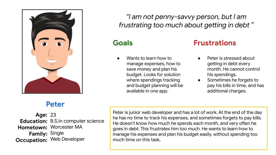
Personas
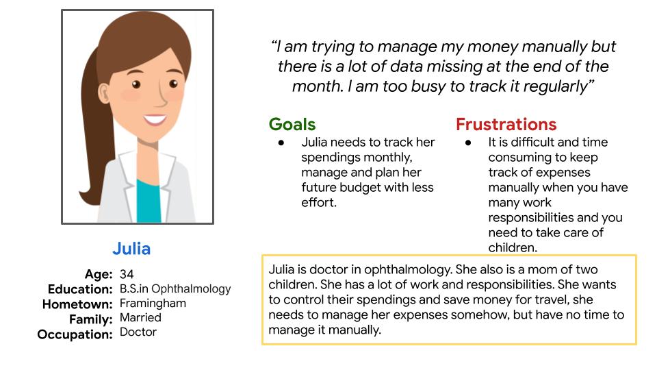
Julia
Problem statement:
Julia is a full time working doctor and mom of two children
who needs time saving and easy way to manage her expenses because she does not have time and self-organization to manage it manually.
Peter
Problem statement:
Peter is a full time working young adult who landed his first job and needs to learn how to manage his spendings because he does not want to get in debt.
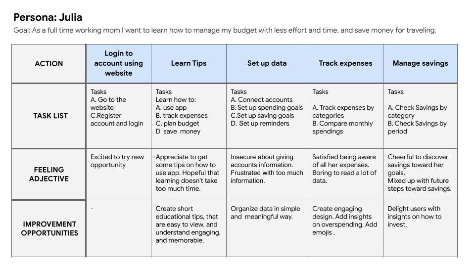
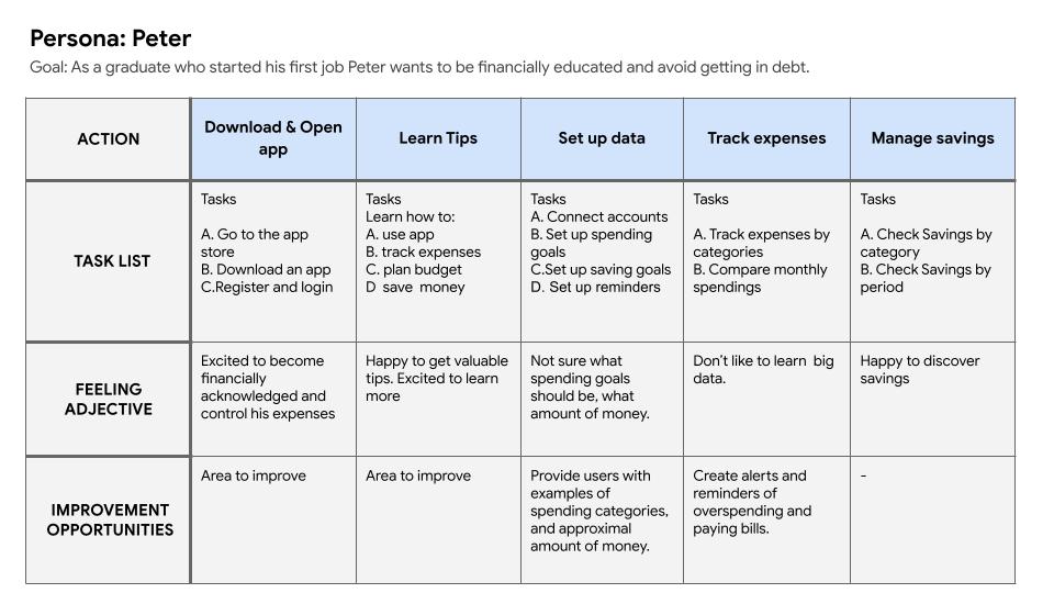
User journey map
Mapping user journey for Julia and Peter revealed how helpful for the busy people would be creating money management and budgeting app.
.
Competitive audit
Starting the design
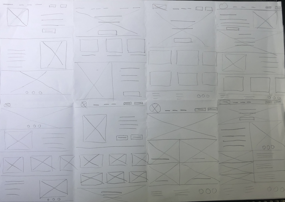
Paper wireframes
Crazy 8 technique was used to come up with ideas for the home page. Later, based on the most interesting ideas from this technique, paper wireframes were created.
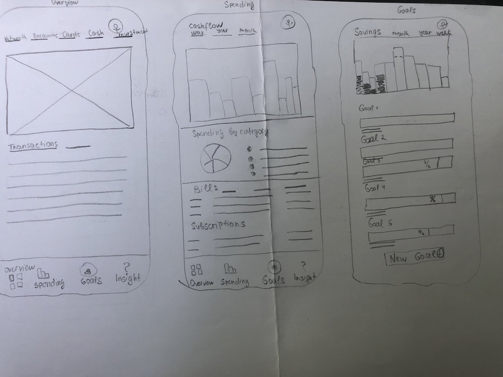
Digital wireframes
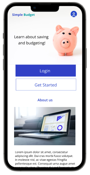
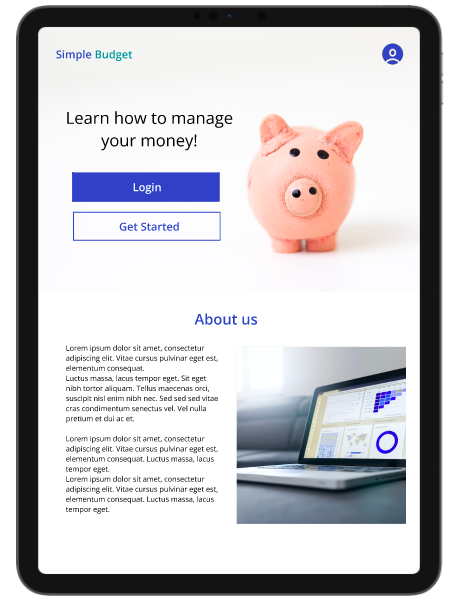
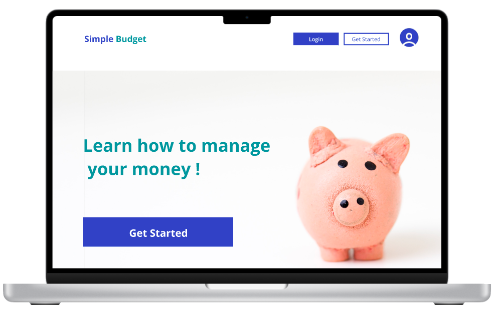
The goal for the website was to create an easy way for young adults and adults to learn about saving, budgeting and money management.
The homepage consists of the information about the product, explains product’s functionality, provides educational posts for those who needs to get better understanding of the finances and money management.
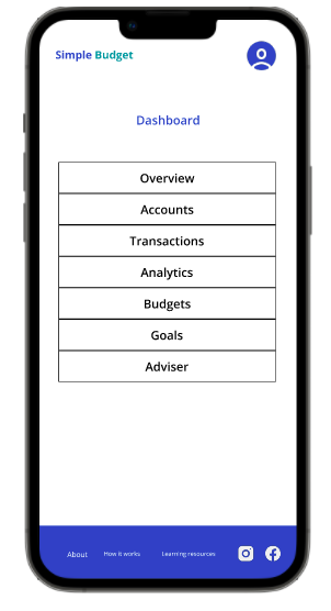
Besides the homepage registered users can login to their personal dashboard where they can start budgeting and saving.
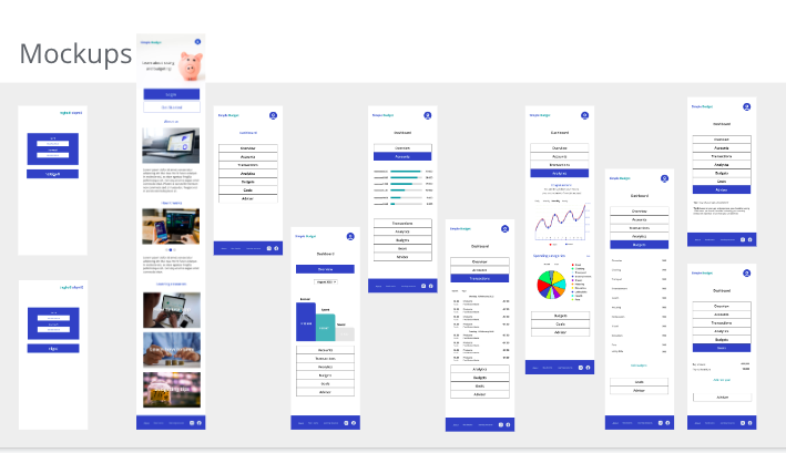
Low-Fidelity Prototype
The low-fidelity prototype connected user flows for returning users and new people who are discovering the product.
Refining the design
Usability study findings
First round
Second round
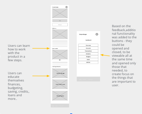
After two rounds of usability studies, in order to address user pain points, some additional pages were created, the color scheme was refined to create functional and usable product
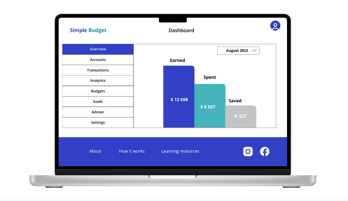
The design of the dashboard was modified based on the usability study finding – it was difficult and time consuming for users to scroll down to find the information they needed. All blocks of information have been organized in the form of drop-down buttons for quick and easy access to the necessary information.
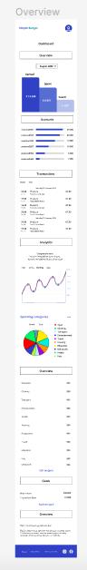
Based on the usability study finding about color similarity on the chart, that makes the chart very hard to view not only for color blinded people, the color scheme has been refined to create more contrast ,and to make the design easy to perceive for wider group of users.
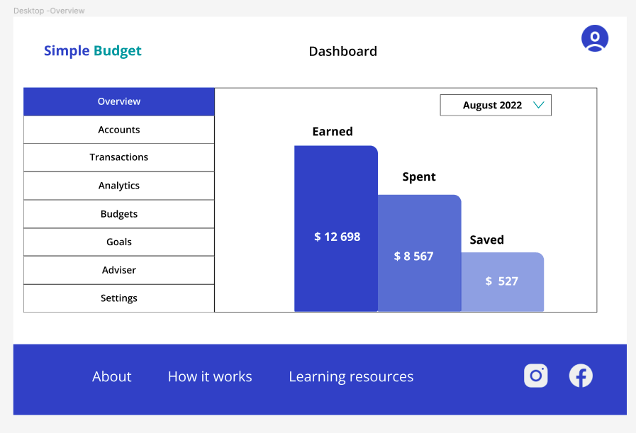
High-fidelity Prototype
Responsive Design
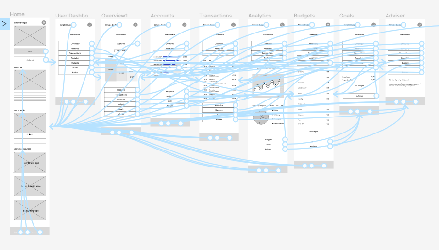
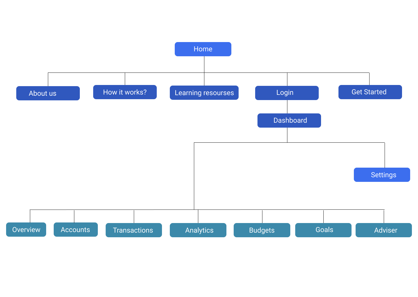
Sitemap
The goal for the website was to provide clear and straightforward user flows for existing and new users.
Based on the users needs discovered during the research phase, a website provides all the important information for new users including learning resources, and easy and fast access to the personal dashboard for existing users.
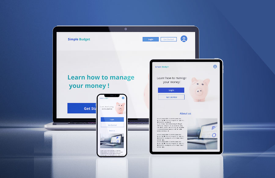
Responsive designs
With responsive designs my website can be easily accessed from different screen sizes. While designing responsive screen designs, my main goal was to arrange all the important information in the way that is easy to perceive for wide groups of users and to make the website focused on the users needs discovered during the research.
Impact
Building a personal finance management app and website will have a positive impact on the financial health and well-being of young people and society as a whole.
By providing accessible and easy-to-understand information, young people can learn how to budget, save, and invest their money wisely.
This will help them avoid common financial pitfalls, such as overspending and debt, and set them on a path towards financial stability and success.
What I learned
After completing this project I learned several valuable lessons. Firstly, I learned the importance of conducting thorough user research to gain a deep understanding of the target audience’s needs, behaviors, and pain points. This helped me to create a user-centered design that met the users’ expectations and provided a seamless user experience.
Secondly, I learned the significance of continuous iteration and testing. I realized that designing a successful product requires constant refinement and improvement based on user feedback. I conducted multiple rounds of user testing to identify usability issues and make necessary changes to the design. This helped me to ensure that the final product was intuitive, easy to use, and met the users’ needs effectively.
Also this project helped me to gain practical knowledge in creating multi device user experience using mobile first approach. I learned how to create responsive website using Progressive Advancement concept and that was a great lesson in synthesizing information.
Overall, I learned that a successful UX design project requires a combination of empathy, creativity, attention to detail, and a problem-solving mindset.